User interface
This guide walks through the main features of LinkedDataHub user interface. See Document management guide for basic definitions such as application and document.
User interface is only one of the interfaces LinkedDataHub provides. The other one is the Command line interface, which supports most of the UI actions.
Note that user interface features are subject to access control. For example, the search box will not be visible if the user is not authorized to access the search container.
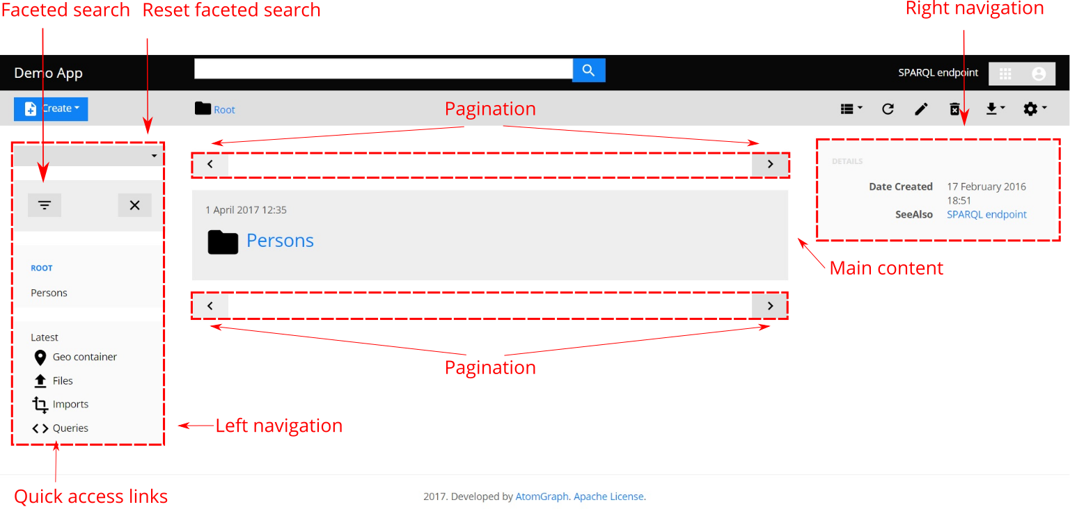
Navigation bar
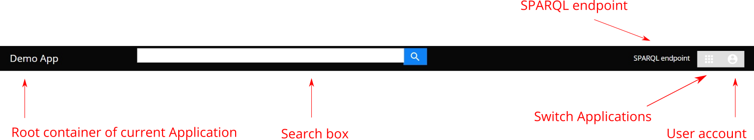
The application title or logo in the top-left always links to the root container of the current application.
Search box lets users search for resources within the current application that have the specified keyword in their titles, descriptions etc. Results are shown in a dropdown list.
Application's SPARQL endpoint is accessible on the right. It offers a query editor and a result view. Learn more about query possibilities in the Query data section.
Current application can be switched using a dropdown on the right. Different users have access to different applications, depending on their authorizations.
Currently logged-in user's account is accessible via the icon on the right, which opens a drop-down. You can log out by clicking the Logout button.
Due to current web browser limitations, it is not possible to logout using client certificate authentication. As a workaround, you can close the browser, and click Cancel when asked to select a certificate the next time.
Action bar
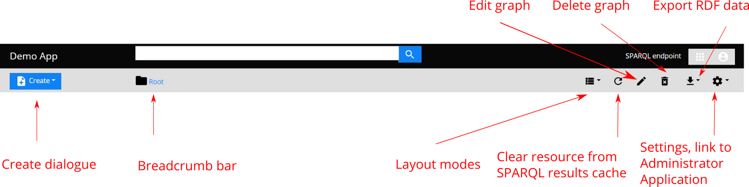
The Create button invokes create dialog through which resources can be created as instances of the classes defined in the model.
The path leading from the current document up the parent/child hierarchy to the root container is shown in the breadcrumb bar, where the current document is always the last breadcrumb. The user can always open any of the ascendant containers by clicking breadcrumbs left from the current one. The icon shows the type of the current document (container or item).
Further to the left, the action bar displays a number of buttons for toggling the available layout modes as well as performing actions on the current document.
Last but not least, the settings button provides a link to the administration application.
Only administration users have access to the administration application.
Layout modes
A list of possible layout modes is displayed, and can be switched using, the mode dropdown in the action bar. Containers and items are available in different modes.
Container (page) layout modes:
- Properties
- The most detailed view showing every property/value of children resources.
- List
- List of children resources with titles and descriptions.
- Table
- Table with children resources as rows, properties as columns, and values as cells
- Grid
- A grid of children resources with titles, descriptions, and depiction thumbnails, if any.
- Map
- Shows all topic resources of the children of the current container that have coordinates
- Graph
- Displays the current document and related resources graphically as nodes in a network using force-directed layout.
Item layout modes:
- Properties
- The most detailed view showing every property/value of the current document and its topic resource, if any.
- Map
- Shows all topic resources of the children of the current container that have coordinates.
- If the topic of current document is on the map, its description will be displayed in an info window.
- Graph
- Displays the current document and related resources graphically as nodes in a network using force-directed layout.
Pagination
Pagination is only available for container resources. Prev/Next pager buttons, located above and below the main content, link to the page before the current one and after the current one, respectively.
Main content
The main content section is located in the center of the screen. Its contents depend on the current document and the current layout mode. Layout modes can be switched in the action bar.
For containers, its children resources (normally a page of them) are shown. The default layout is list.
For items, its XHTML content and properties/values of its topic resource (if any) are shown. The default layout is properties.
Left navigation
The left-side navigation provides access to the first-level children of the root container.
Depending on the type of the current container, a faceted search that filters its children using combinations of subclass types can also be shown.
At the bottom of this section you will find quick access links to the following system containers:
- Latest
- A container with the latest resources in the application's dataset by creation/modification date
- Files
- A container for file uploads
- Imports
- A container for data imports
- Queries
- A container for end-user SPARQL queries (including vocabulary mappings)
- Geo
- A container with all resources in the application's dataset that have geographic coordinates
- Charts
- A container with charts that visualize SPARQL query results
Right navigation
The right-side navigation shows details of the current document, such as creator and creation/modification date. Additionally, it can show contextual links depending on the type of current document.
Create/Edit dialog
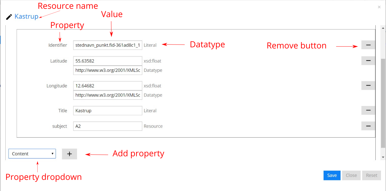
Resources are created and updated using the same form-based dialog. The form can display either a document alone, or a document paired with its topic resource. Each resource is displayed in a separate fieldset; fieldsets are nested for related resources.
Properties are listed inside fieldsets and their values shown as user inputs. When creating or updating a resource which type is a class defined in the model, resource properties are specified by the class constructor.
Values of object properties are displayed as typeahead input allowing users to type keywords and select matching resources from a dropdown list. The list is filtered by resource type specified in the constructor. Typeahead inputs also allow absolute URI values.
Mandatory properties are those for which there exists a constraint on a class that is being created or edited. Mandatory properties do not have a remove button. New property with a value can be added using the property dropdown (at the bottom of fieldset).
If any of the resources are invalid (because of URI syntax errors or constraint violations) when attempting to save the data, you will see error messages and highlighted inputs for the properties which have invalid values. Resource creation or update cannot be performed until these errors are fixed.